Behind the Art of LUTHER
“We had the unique opportunity to tell the story through animation in ways the live-action sequences never could.”
What a privilege it has been to collaborate with Stephen McCaskell and the whole team on LUTHER: The Life and Legacy of the German Monk! It was an honor to partner with them to bring the transformational story of Martin Luther to life and to tell the story of the Reformation in a fresh way for hopefully generations to come.
Every new project is exciting for artists and we always seem to be attracted to new challenges. However when LUTHER’s director of animation, Jorge R. Canedo Estrada, first asked me to collaborate with him in the art direction and illustrations for LUTHER, I was excited and terrified. Needless to say, the pressure was on and I’m quite certain I would still be working on those illustrations if it wasn’t for our tight, demanding deadlines. I am sure Jorge would agree with me on the animation side as well.
Working With Constraints
Our biggest constraint was time, time, and time. Since Jorge and I only had around two and a half months to design, illustrate, and animate, we needed to approach the art direction simply, yet with engagement and authenticity. Working right alongside Jorge in the art direction was crucial for me in order to find an aesthetic that would carry the dramatic weight which the story demanded. At the same time, we needed to make sure the animators would be able to animate easily and deliver on time, while hopefully still being friends at the end of the day (smile).
Byzantine
Gothic
Finding the Aesthetic and Visual Narrative
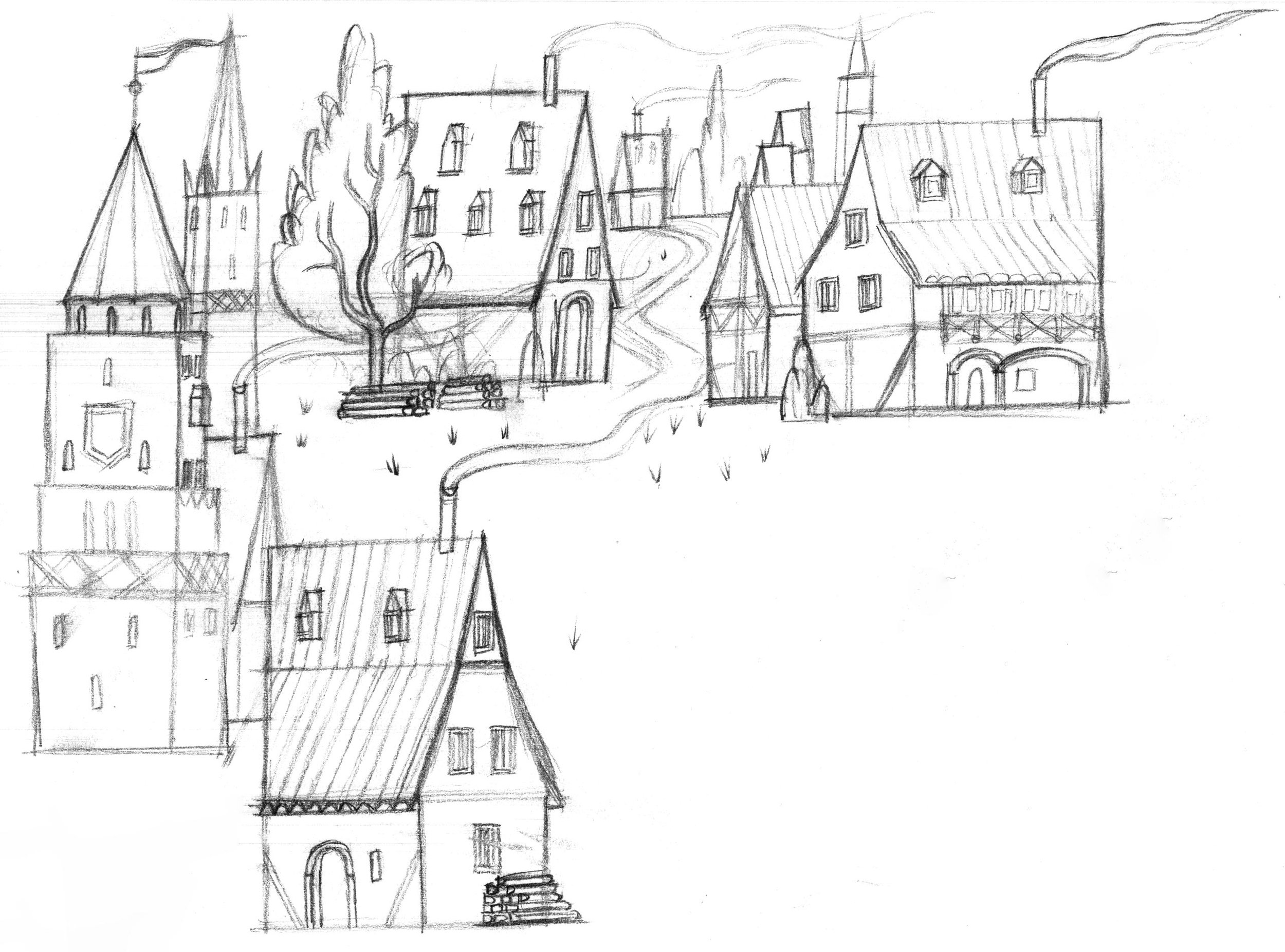
I dedicated time to research medieval art and architecture (among other influences) in order to be informed and inspired regarding the direction for the art of LUTHER. Medieval art not only includes major art movements and periods, but regional art as well. I mainly focused on byzantine (330-1453 A.D.), romanesque (1000-1150 A.D.), and gothic art (1200-1600 A.D.) in particular, which are almost entirely concerned with religious expression. The research inspired our approach to the shape, language, lighting, texture, color, etc.
Why byzantine, romanesque, and gothic art? Well, imagine someone was trying to capture our twenty-first century environment while living in the thirty-sixth century--1500 years removed! The artist capturing that environment would need to pay close attention to the fashion, architecture, and other surroundings of our time. Those time periods mentioned above influenced the world Martin Luther knew.
Romanesque
Medieval art (known for its religiosity, flatness, long proportions, and graphic imagery) seems to portray a misguided view of God, one of God as unloving, unjust, and far-removed. This is the exact way that Martin Luther pictured his Creator. It was the truth of the Word of God that ultimately illuminated Luther’s eyes, heart, and mind.
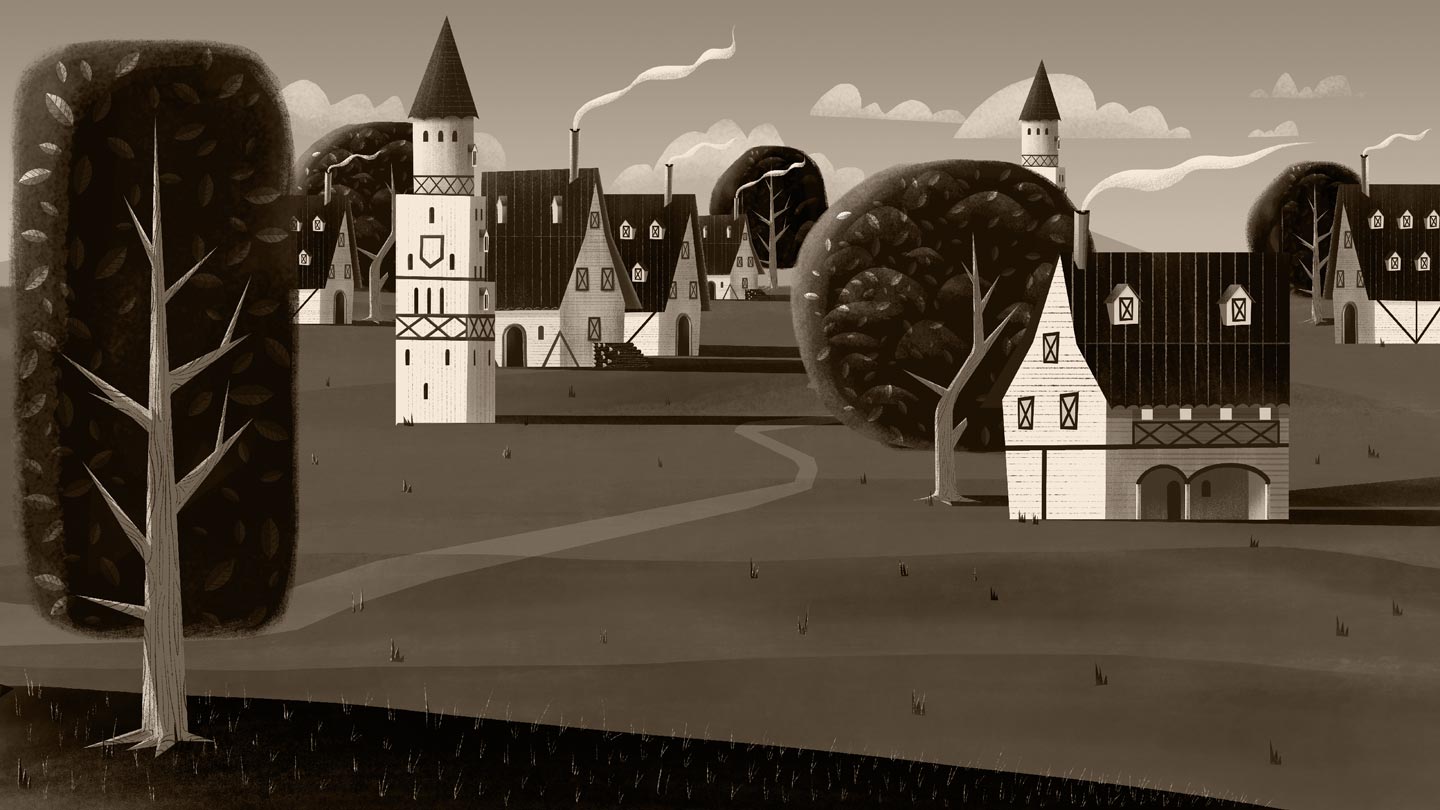
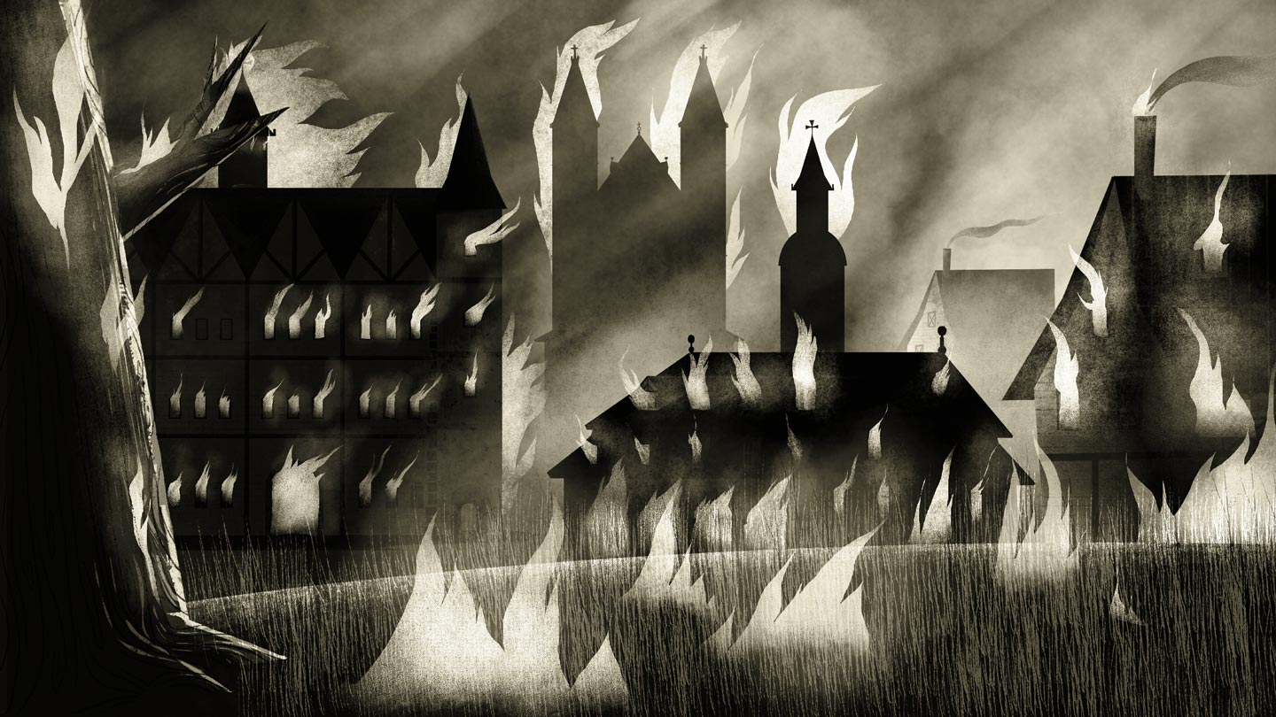
The art of LUTHER intends to depict the decadent state of the church at the time, as well as the enlightening and life-giving nature of the gospel.
Storyboarding
The purpose of the animated sequences in LUTHER was to support the informational and interview (or live-action) portions with dramatic storytelling. So we wanted to suggest an idea of what Luther’s world may have felt like. I believe suggestive is a good word to describe the art direction behind LUTHER because we never intended to photograph Luther’s life but rather to simply give an impression of it. We had the unique opportunity to tell the story through animation in ways the live-action sequences never could.
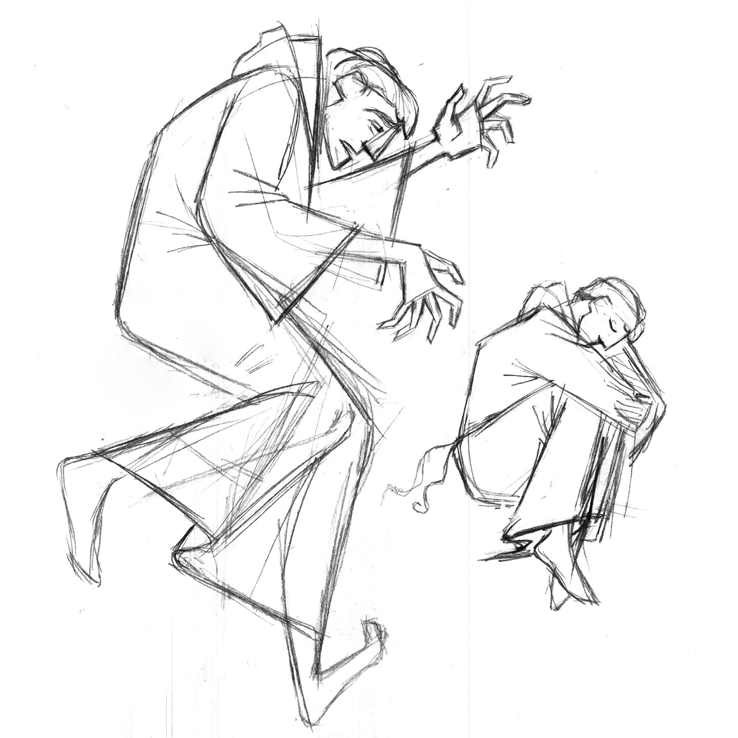
As Jorge and I sat down to storyboard, we would pitch each other very rough ideas about how we should frame a shot. Some sequences are figurative (metaphorical) and others are more cinematic (having the features of a motion picture). One of the aspects that I most enjoyed in the project was thinking and illustrating as a filmmaker. My intention was to provide a cinematic feel to every frame, which Jorge and the team of animators were able to capture beautifully.
The Role of Lighting and Color
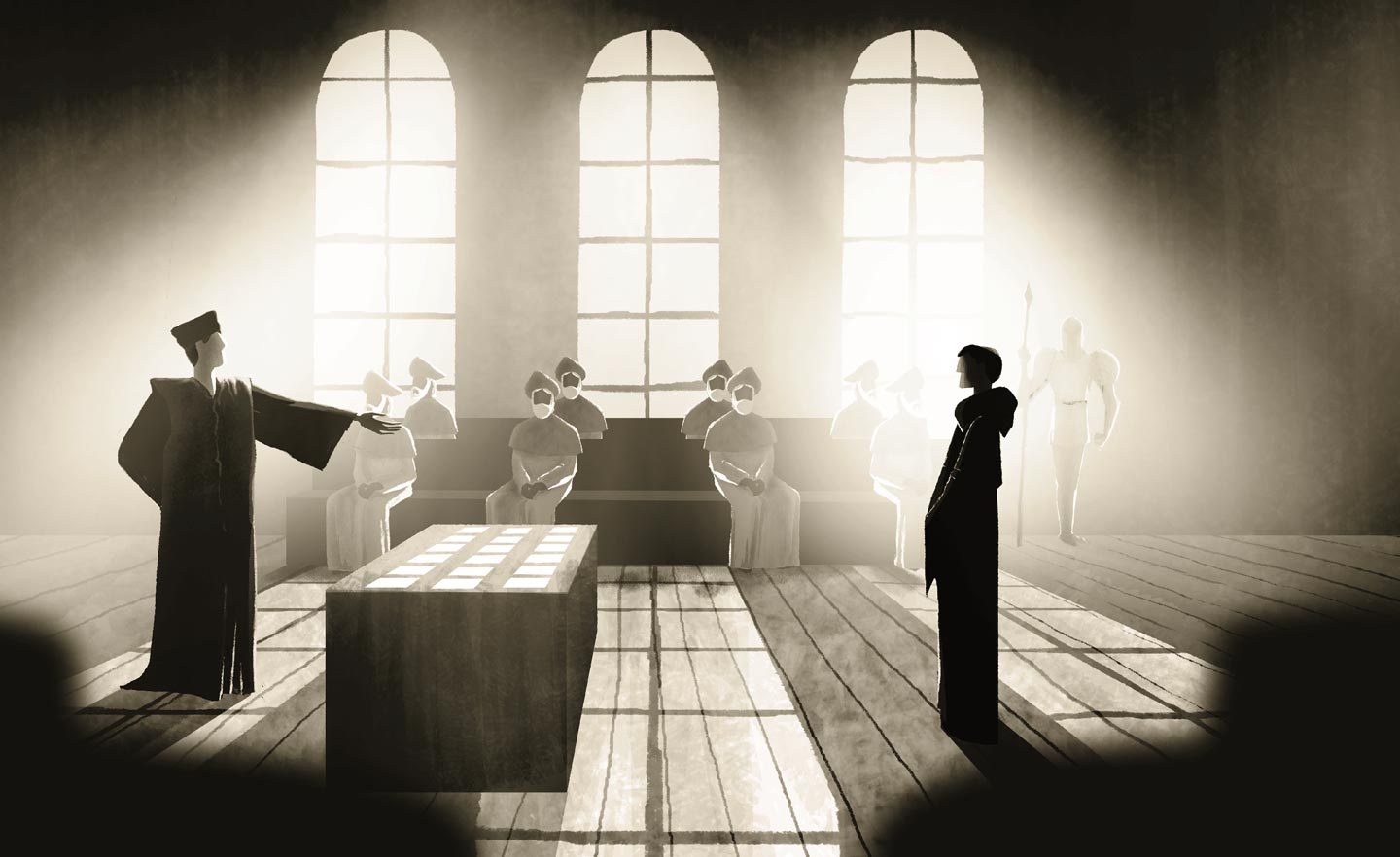
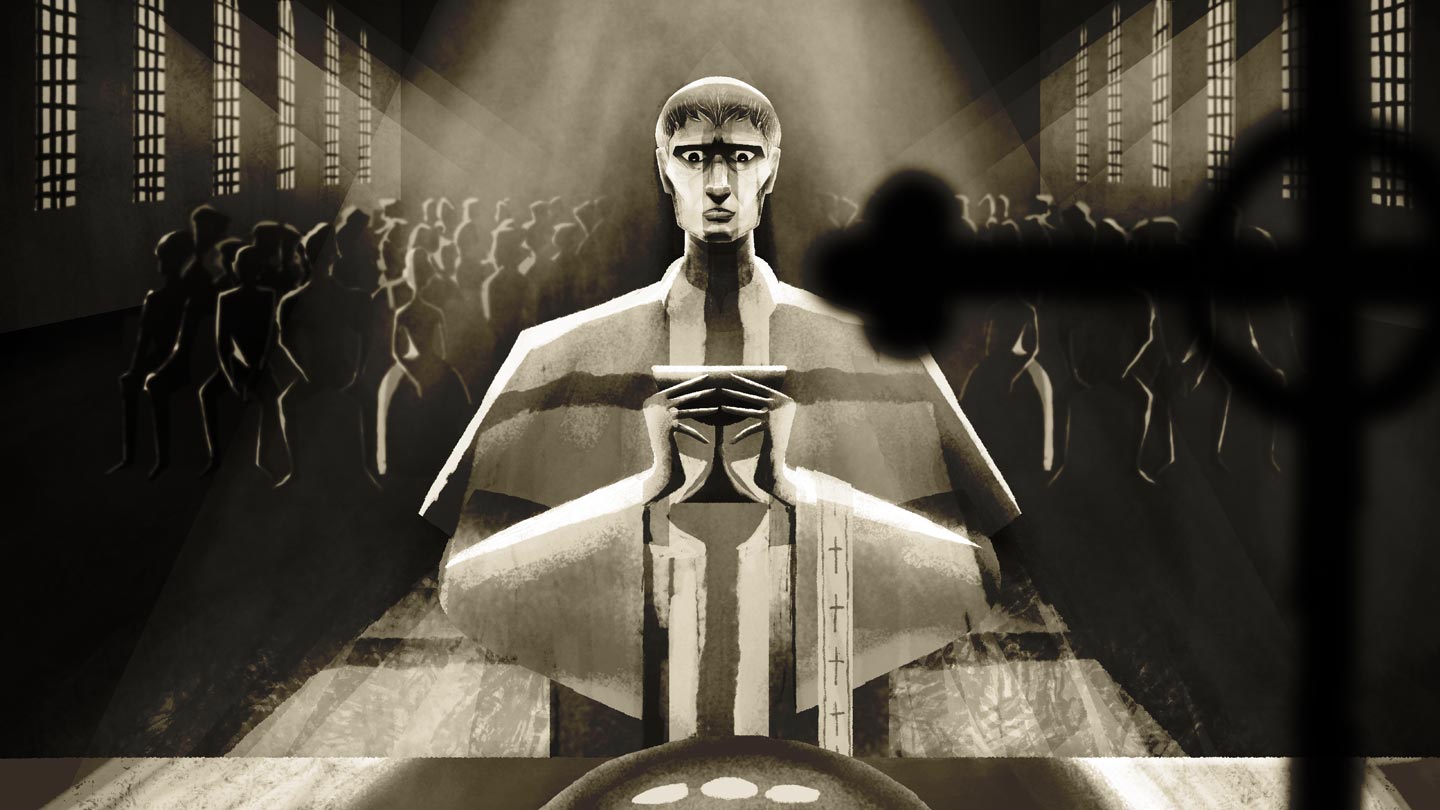
Another key element that adds to the sense of drama and believability in LUTHER is the theatrical style of lighting. In every frame, the atmosphere and mood are just as important if not more important than the specific details within the frame.
We wanted to approach a monochromatic color palette to emphasize the shapes and atmosphere of each frame more highly. The color palette of LUTHER incorporates less saturation (colorfulness of an image) and higher contrast. We believe this choice in art direction further supports the tone and conflict of the story.
Serving the Audience
Each artist makes decisions on how to express ideas, and to a certain extent, the effectiveness of those ideas depends on his/her skills in communicating them. However the themes of the German monk’s story are sobering and profound, and there’s so much that one could express. Ultimately, it is my deep hope that these images serve the audience as a small window into the ONLY truth that makes the story of Luther matter most: the gospel, Christ Jesus himself.


